
21 May 2011
Working With Wim (and Factory Records)
8vo's Mark Holt and Hamish Muir talked about their work at the Working With Wim event at the Design Museum in London on 9 May 2011.
Meanwhile, the catalogue for the ongoing Wim Crouwel: A Graphic Odyssey exhibition itself features an interview with Wim Crouwel by exhibition curator Tony Brook. There are couple of snippets for Factory fans:
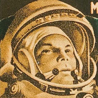
Were you surprised to see New Alphabet used on the cover of a Joy Division record cover (Substance 1977-1980), designed by Peter Saville and Brett Wickens?
I discovered this at the end of the 1990s, and I was flattered that people had used it. I have seen it in pop magazines - mostly as headlines, and sometimes made a little more readable. They always made it by hand and didn't always follow my strict rules and guidelines. Suddenly, at the end of the 1990s, there was interest in this thing that had been developed 25 years before. That was also the time The Foundry came to me and asked if they could digitize my typefaces for their series of experimental typefaces by people like Jan Tschichold. I was greatly flattered. I immediately gave them permission, and I worked on the project with David Quay from The Foundry.
During your time at the Boijmans Museum you started working with the renowned English design group 8vo - how did that come about?
... I was invited by 8vo to do an article on lower-case typography for their magazine, Octavo. By doing this I got to know the three of them - Hamish Muir, Mark Holt and Simon Johnston - and I was impressed by their work. Hamish and Simon had trained in Basel and there was a strong influence from Swiss design, but different from what the Swiss did. I was impressed by their work, and also by the work, and also by the magazine, the layout of the Octavo magazine. In Holland during the 1980s, nothing of that direction was visible. I was so impressed that I immediately invited them to do the posters and catalogues for the museum. That was quite difficult, because we had a production manager in Holland, and a printing company in Belgium, and they were in London. We didn't have enough money to have them travelling back and forth all the time, so they invented a way to do it all by fax machine - we didn't have email at that point, so it was all done by fax and telephone.
Working like that must have been difficult. What did 8vo do that was so different?
8vo developed a direction for each department in the museum, and if you see the whole range of catalogues, you will see that they created a very recognizable series. It was difficult for me to be a commissioner, but when I started with them I said, the only thing you have to do is use Futura, because that was the museum's typeface. The size of the catalogue and the size of the posters was more or less fixed. The biggest difficulty they had was with Futura - they were really Helvetica people. For them it was a shock to have to work with Futura. But I think what they did was fantastic. I was very happy with that period. For about five years, they did all my catalogues and posters.
--
Wim Crouwel: A Graphic Odyssey
Unit 04
Catalogue for the exhibition
Wim Crouwel: A Graphic Odyssey
at the Design Museum, London
30 March - 03 July 2011
144pp, 152x230mm
Cover No. 3
Printed in the Netherlands
Unit Editions
www.uniteditions.com
ISBN: 978-0-9562071-3-5
£16.95
Meanwhile, the catalogue for the ongoing Wim Crouwel: A Graphic Odyssey exhibition itself features an interview with Wim Crouwel by exhibition curator Tony Brook. There are couple of snippets for Factory fans:
Were you surprised to see New Alphabet used on the cover of a Joy Division record cover (Substance 1977-1980), designed by Peter Saville and Brett Wickens?
I discovered this at the end of the 1990s, and I was flattered that people had used it. I have seen it in pop magazines - mostly as headlines, and sometimes made a little more readable. They always made it by hand and didn't always follow my strict rules and guidelines. Suddenly, at the end of the 1990s, there was interest in this thing that had been developed 25 years before. That was also the time The Foundry came to me and asked if they could digitize my typefaces for their series of experimental typefaces by people like Jan Tschichold. I was greatly flattered. I immediately gave them permission, and I worked on the project with David Quay from The Foundry.
During your time at the Boijmans Museum you started working with the renowned English design group 8vo - how did that come about?
... I was invited by 8vo to do an article on lower-case typography for their magazine, Octavo. By doing this I got to know the three of them - Hamish Muir, Mark Holt and Simon Johnston - and I was impressed by their work. Hamish and Simon had trained in Basel and there was a strong influence from Swiss design, but different from what the Swiss did. I was impressed by their work, and also by the work, and also by the magazine, the layout of the Octavo magazine. In Holland during the 1980s, nothing of that direction was visible. I was so impressed that I immediately invited them to do the posters and catalogues for the museum. That was quite difficult, because we had a production manager in Holland, and a printing company in Belgium, and they were in London. We didn't have enough money to have them travelling back and forth all the time, so they invented a way to do it all by fax machine - we didn't have email at that point, so it was all done by fax and telephone.
Working like that must have been difficult. What did 8vo do that was so different?
8vo developed a direction for each department in the museum, and if you see the whole range of catalogues, you will see that they created a very recognizable series. It was difficult for me to be a commissioner, but when I started with them I said, the only thing you have to do is use Futura, because that was the museum's typeface. The size of the catalogue and the size of the posters was more or less fixed. The biggest difficulty they had was with Futura - they were really Helvetica people. For them it was a shock to have to work with Futura. But I think what they did was fantastic. I was very happy with that period. For about five years, they did all my catalogues and posters.
--
Wim Crouwel: A Graphic Odyssey
Unit 04
Catalogue for the exhibition
Wim Crouwel: A Graphic Odyssey
at the Design Museum, London
30 March - 03 July 2011
144pp, 152x230mm
Cover No. 3
Printed in the Netherlands
Unit Editions
www.uniteditions.com
ISBN: 978-0-9562071-3-5
£16.95
Labels: 8vo, design, graphic_design, Joy_Division, Peter_Saville, Wim_Crouwel
- - - -
Popular posts
Use Hearing Protection - Factory Records 1978-1979
Use Hearing Protection Factory Records 1978-1979 review
Hacienda How Not to Run a Club TV series
Use Hearing Protection - Fac 1-50 / 40 exhibition
Out of Order - Curating the Factory Catalogue
The Drifting Cowboys Durutti Column T-Shirt
Latest posts
Latest pages
- Electronic Sound magazine [Issue 54] Factory Records
- May 1980 release schedule
- hallowed articles
- FAC 148
- FAC 148 letter from Quarry Bank Mill to Tony Wilson
- FAC 81 stationery source materials
- FAC 81 stationery
- 86 Palatine Road Blue Plaque
- Joy Divison USA Tour Itinerary
- Tony Wilson letter to Ralph Steadman re John Dowie
- IKON stationery
- The Factory stationery
- In the City badge
- Peter Saville Associates stationery and bill
- Movement of the 24th January stationery


<< Home