
3 Jan 2007
Pet Shop Boys Versus Factory
The excellent book 'Pet Shop Boys - Catalogue' (Thames and Hudson, ISBN 978-0-500-51307-1) by Philip Hoare and Chris Heath contains a number of insights relevant to ardent Factory fans and is a darn good read and beautifully put together to boot.
Main PSB designer Mark Farrow served his apprenticeship at Factory and brought with him many of Factory's design ethics as the following extracts show (with occasional annotations):
West End Girls
'the 12" sleeve was partly designed by Chris. It has a marked relationship to the design of New Order's Blue Monday 12" by Peter Saville (which emulated an early computer disc and was die-cut and ruinously expensive to produce) - the release of which was said to have brought Neil close to tears when it arrived at Smash Hits, so liberally did it seem to borrow from the. style of their favourite producer, Bobby 'O'.'
(Bobby 'O' would later, in turn, in a supreme irony, rip off Blue Monday. In a further twist, New Order would also do a live cover of Divine's Love Reaction which was a Bobby 'O' production!)
West End girls (remix)
Mark Farrow - 'I hated the original sleeve - the fact that there were two different typefaces, one of the typefaces had three different sizes in it, just everything about it I loathed and detested. I had the whole Factory ethic in my head. So the first thing I did was strip all the type off it, and we just had the coloured blocks and the background.'
(The myriad unofficial remixes like 'West End Sunglasses', put out by Bobby 'O' feature badly designed sleeves that have nothing to do with the Farrow designs, except for some "borrowed" typeface theft.)
Please (album, 1986)
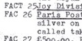
'The design of Please, released in March 1986, was as minimal as its title. Virtually every detail was stripped away, leaving only an image barely bigger than a postage stamp, with the group's name and album title below. The effect was to draw the viewer in, towards what is ostensibly an innocent image, but is in fact one of seductive desire. Mark Farrow had designed a sleeve at Factory Records for the group Section 25 with a tiny photo on it, and had liked the way it looked. 'It's almost the starting point, when I design a cover, that it shouldn't look like a cover', says Farrow.'
Opportunities (single, May 1986)
'It's a kind of a Factory sleeve, really', says Mark Farrow. 'It was gold and silver because that's what money is. I don't remember there being any big decision about there not being a photo on it.'
Domino Dancing
'Again, that's like a Factory sleeve, but rather than finding something really obscure, it was a Polaroid of Neil and Chris. It was presenting everything to do with the record in a very matter-of-fact way.'
Behaviour
'In Japan the album was released also in a white velvet box, a fantastically impractical and almost fetishistic object to rival Factory Records' celebrated The Return of the Durutti Column, which came clad in sandpaper.'
(It might be added that the "velvet" box really has nowhere near the "fetish" aspects of FACT 14. But it does have an almost magnetic attraction to dirt and dust and it doesn't ruin the rest of your record collection.)
--
Furthermore, photographers like Robert Mapplethorpe, The Douglas Brothers, Wolfgang Tillmans, Trevor Key all did PSB and FAC work.
And then there's Electronic...
--
With thanks to OMNY.
Main PSB designer Mark Farrow served his apprenticeship at Factory and brought with him many of Factory's design ethics as the following extracts show (with occasional annotations):
West End Girls
'the 12" sleeve was partly designed by Chris. It has a marked relationship to the design of New Order's Blue Monday 12" by Peter Saville (which emulated an early computer disc and was die-cut and ruinously expensive to produce) - the release of which was said to have brought Neil close to tears when it arrived at Smash Hits, so liberally did it seem to borrow from the. style of their favourite producer, Bobby 'O'.'
(Bobby 'O' would later, in turn, in a supreme irony, rip off Blue Monday. In a further twist, New Order would also do a live cover of Divine's Love Reaction which was a Bobby 'O' production!)
West End girls (remix)
Mark Farrow - 'I hated the original sleeve - the fact that there were two different typefaces, one of the typefaces had three different sizes in it, just everything about it I loathed and detested. I had the whole Factory ethic in my head. So the first thing I did was strip all the type off it, and we just had the coloured blocks and the background.'
(The myriad unofficial remixes like 'West End Sunglasses', put out by Bobby 'O' feature badly designed sleeves that have nothing to do with the Farrow designs, except for some "borrowed" typeface theft.)
Please (album, 1986)
'The design of Please, released in March 1986, was as minimal as its title. Virtually every detail was stripped away, leaving only an image barely bigger than a postage stamp, with the group's name and album title below. The effect was to draw the viewer in, towards what is ostensibly an innocent image, but is in fact one of seductive desire. Mark Farrow had designed a sleeve at Factory Records for the group Section 25 with a tiny photo on it, and had liked the way it looked. 'It's almost the starting point, when I design a cover, that it shouldn't look like a cover', says Farrow.'
Opportunities (single, May 1986)
'It's a kind of a Factory sleeve, really', says Mark Farrow. 'It was gold and silver because that's what money is. I don't remember there being any big decision about there not being a photo on it.'
Domino Dancing
'Again, that's like a Factory sleeve, but rather than finding something really obscure, it was a Polaroid of Neil and Chris. It was presenting everything to do with the record in a very matter-of-fact way.'
Behaviour
'In Japan the album was released also in a white velvet box, a fantastically impractical and almost fetishistic object to rival Factory Records' celebrated The Return of the Durutti Column, which came clad in sandpaper.'
(It might be added that the "velvet" box really has nowhere near the "fetish" aspects of FACT 14. But it does have an almost magnetic attraction to dirt and dust and it doesn't ruin the rest of your record collection.)
--
Furthermore, photographers like Robert Mapplethorpe, The Douglas Brothers, Wolfgang Tillmans, Trevor Key all did PSB and FAC work.
And then there's Electronic...
--
With thanks to OMNY.
Labels: Factory_Records, Mark_Farrow, New_Order, Pet_Shop_Boys, Section_25, The_Durutti_Column
- - - -
Popular posts
Use Hearing Protection - Factory Records 1978-1979
Use Hearing Protection Factory Records 1978-1979 review
Hacienda How Not to Run a Club TV series
Use Hearing Protection - Fac 1-50 / 40 exhibition
Out of Order - Curating the Factory Catalogue
The Drifting Cowboys Durutti Column T-Shirt
Latest posts
Latest pages
- Electronic Sound magazine [Issue 54] Factory Records
- May 1980 release schedule
- hallowed articles
- FAC 148
- FAC 148 letter from Quarry Bank Mill to Tony Wilson
- FAC 81 stationery source materials
- FAC 81 stationery
- 86 Palatine Road Blue Plaque
- Joy Divison USA Tour Itinerary
- Tony Wilson letter to Ralph Steadman re John Dowie
- IKON stationery
- The Factory stationery
- In the City badge
- Peter Saville Associates stationery and bill
- Movement of the 24th January stationery


<< Home