
9 Mar 2008
The Memoirs of a Factory Designer
Phill Pennington designed several key Factory Records pieces whilst working at Peter Saville Associates.
He talks exclusively to Cerysmatic Factory about this intriguing time in the development of Factory:
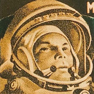
"I designed the Factory logo which is simple factory symbol, initially with five other symbols for a poster to be used by Alan Erasmus in Moscow (FAC 126). My approach to designing the symbols was inspired by the well known Isotype system designed by Otto Neurath and Gerd Arntz in the 1920s.
The factory symbol went through several variations as I tried different proportions different numbers of roofs, windows, waves in the smoke and so on before arriving at what seemed to be the most minimal version possible. The symbol was not at the point intended to be the Factory logo, but as I mentioned, one of a set specifically designed for FAC 126. I did produce one other symbol a Christmas tree in the same style, which was used on a Factory Christmas card.
Confusion (FAC 93) was the only New Order sleeve I actually designed in its entirety. The idea came from seeing small colour registration letters on a type of printers proof known as a Chromalin. These letters were made of squares and printed in the basic 4 colours (CMYK) with the words overlapping in a confusing way, this seemed to tie in with the title, and I found that the words New Order and Confusion had the same number of characters (including the space).
So it was possible to overlap them in a confusing way. I wanted the finished piece to look like it was part of a spacecraft from some time in the future, sort of markings in the same way that military aircraft have markings, a piece of space wreckage from the future. To this end, my original version had the FAC number (93) made out of dots. It was Brett Wickens who decided that it should be in Gill.
I still feel it would have been stronger the other way. The sleeve was printed in four colour, plus four special colours, plus embossing. I think that they lost money on each copy produced, and the embossing was dropped after the original run, nobody talked about costs at the time.
I did also design a seven-inch version of the sleeve, which consisted of a set of different parts of the 12 inch cropped to seven inches. A full printer's proof was produced, but for some reason the sleeve was never used. The record label used a blown up sample of dot matrix letters (fairly new technology at the time).
I did the artwork for the follow up single, 'Thieves Like Us' (FAC 103), the numbers around the central image were taken from an Eighteenth Century board game which Peter had seen in a magazine (and which coincidentally turned out to be called 'the Jews game'), we decided to make them completely random and then wait for people to read some arcane or sinister message into them, which they did in the music press.
I designed the typography for the Factory boxed cassette series. The type arrangement is set in Bembo and is based on mathematical matrices. The most time-consuming part was Peter choosing the colours for the cloth bindings. I understand they were difficult for record shops to display.
I also designed, with Peter, the title sequence for the Channel Four series 'Play at Home', and a poster based on this, in our then new 'tech' style. We essentially had a computer animator record the process of constructing some titles then just used all the 'technical bits' which would normally would be edited out."
--
Many thanks to Phill.
He talks exclusively to Cerysmatic Factory about this intriguing time in the development of Factory:
"I designed the Factory logo which is simple factory symbol, initially with five other symbols for a poster to be used by Alan Erasmus in Moscow (FAC 126). My approach to designing the symbols was inspired by the well known Isotype system designed by Otto Neurath and Gerd Arntz in the 1920s.
The factory symbol went through several variations as I tried different proportions different numbers of roofs, windows, waves in the smoke and so on before arriving at what seemed to be the most minimal version possible. The symbol was not at the point intended to be the Factory logo, but as I mentioned, one of a set specifically designed for FAC 126. I did produce one other symbol a Christmas tree in the same style, which was used on a Factory Christmas card.
Confusion (FAC 93) was the only New Order sleeve I actually designed in its entirety. The idea came from seeing small colour registration letters on a type of printers proof known as a Chromalin. These letters were made of squares and printed in the basic 4 colours (CMYK) with the words overlapping in a confusing way, this seemed to tie in with the title, and I found that the words New Order and Confusion had the same number of characters (including the space).
So it was possible to overlap them in a confusing way. I wanted the finished piece to look like it was part of a spacecraft from some time in the future, sort of markings in the same way that military aircraft have markings, a piece of space wreckage from the future. To this end, my original version had the FAC number (93) made out of dots. It was Brett Wickens who decided that it should be in Gill.
I still feel it would have been stronger the other way. The sleeve was printed in four colour, plus four special colours, plus embossing. I think that they lost money on each copy produced, and the embossing was dropped after the original run, nobody talked about costs at the time.
I did also design a seven-inch version of the sleeve, which consisted of a set of different parts of the 12 inch cropped to seven inches. A full printer's proof was produced, but for some reason the sleeve was never used. The record label used a blown up sample of dot matrix letters (fairly new technology at the time).
I did the artwork for the follow up single, 'Thieves Like Us' (FAC 103), the numbers around the central image were taken from an Eighteenth Century board game which Peter had seen in a magazine (and which coincidentally turned out to be called 'the Jews game'), we decided to make them completely random and then wait for people to read some arcane or sinister message into them, which they did in the music press.
I designed the typography for the Factory boxed cassette series. The type arrangement is set in Bembo and is based on mathematical matrices. The most time-consuming part was Peter choosing the colours for the cloth bindings. I understand they were difficult for record shops to display.
I also designed, with Peter, the title sequence for the Channel Four series 'Play at Home', and a poster based on this, in our then new 'tech' style. We essentially had a computer animator record the process of constructing some titles then just used all the 'technical bits' which would normally would be edited out."
--
Many thanks to Phill.
Labels: artefacts, Christmas, Factory_Records, New_Order, poster
- - - -
Popular posts
Use Hearing Protection - Factory Records 1978-1979
Use Hearing Protection Factory Records 1978-1979 review
Hacienda How Not to Run a Club TV series
Use Hearing Protection - Fac 1-50 / 40 exhibition
Out of Order - Curating the Factory Catalogue
The Drifting Cowboys Durutti Column T-Shirt
Latest posts
Latest pages
- Electronic Sound magazine [Issue 54] Factory Records
- May 1980 release schedule
- hallowed articles
- FAC 148
- FAC 148 letter from Quarry Bank Mill to Tony Wilson
- FAC 81 stationery source materials
- FAC 81 stationery
- 86 Palatine Road Blue Plaque
- Joy Divison USA Tour Itinerary
- Tony Wilson letter to Ralph Steadman re John Dowie
- IKON stationery
- The Factory stationery
- In the City badge
- Peter Saville Associates stationery and bill
- Movement of the 24th January stationery


<< Home